OVI

project overview
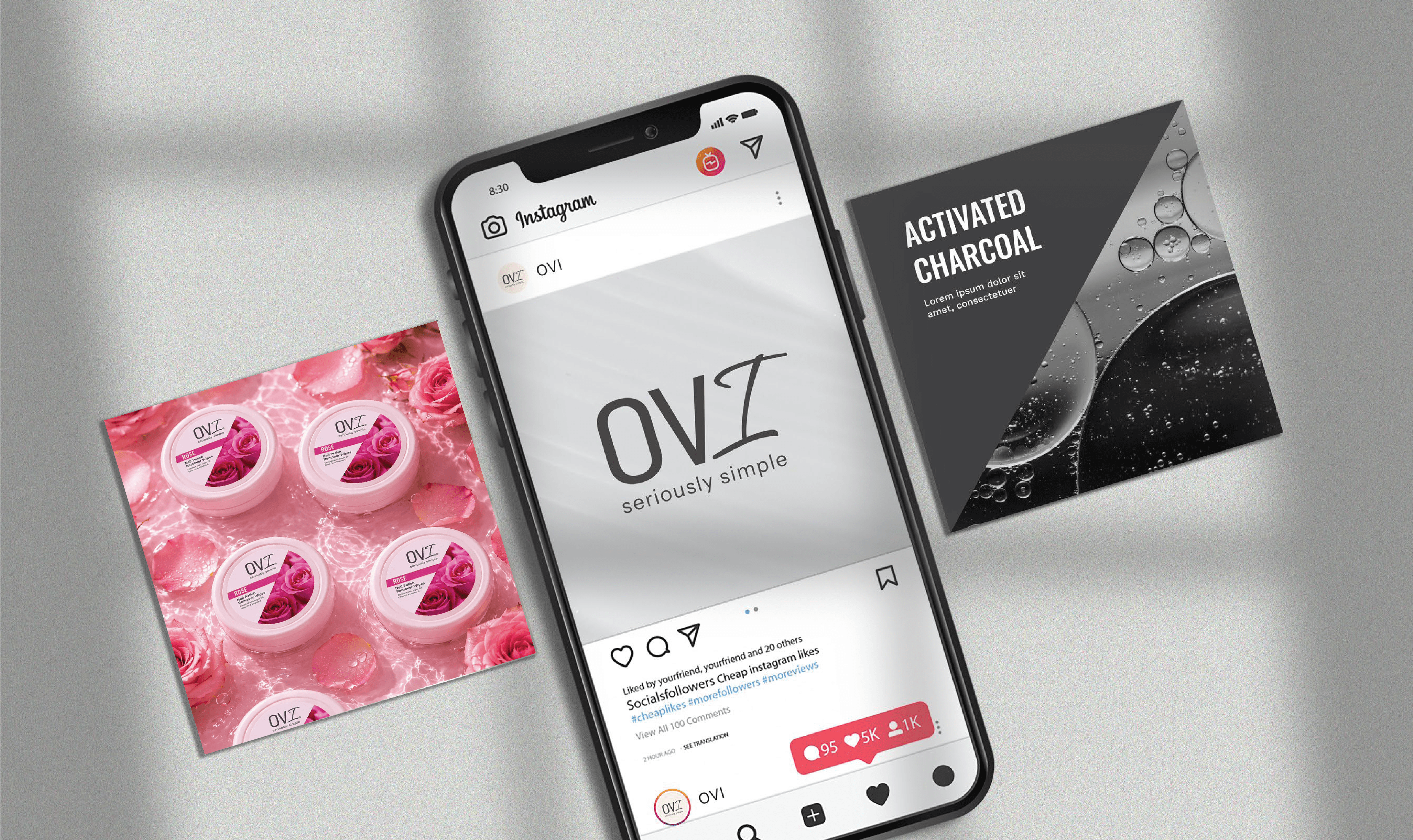
OVI is a skincare brand built around “Only Verified Ingredients,” bringing together science, transparency, and everyday skincare. The identity was designed to make the brand feel trustworthy and clear without losing its human side.
project type
Brand Identity | Visual System
year
2025
my role
Brand designer
client
OVI


The category was loud.
We didn't need to be louder. We needed to be more recognisable.


A brand with a little more toss.
TOSS'D is all about mixing things up, and the identity brings that spirit to life through movement, bold typography, playful layering and unexpected combinations.
A little tossed, never thrown together.


OVI

OVI
OVI


project overview
OVI is a skincare brand built around “Only Verified Ingredients,” bringing together science, transparency, and everyday skincare. The identity was designed to make the brand feel trustworthy and clear without losing its human side.
project type
Brand Identity | Visual System
year
2025
my role
Brand designer
client
OVI


The category was loud.
We didn't need to be louder. We needed to be more recognisable.
project overview
OVI is a skincare brand built around “Only Verified Ingredients,” bringing together science, transparency, and everyday skincare. The identity was designed to make the brand feel trustworthy and clear without losing its human side.
project type
Brand Identity | Visual System
year
2025
my role
Brand designer
client
OVI

THE PROBLEM The skincare category is crowded with brands competing through clinical visuals, bold claims, and increasingly complex ingredient stories. OVI needed to stand apart while making its promise of transparency and verified ingredients easy to understand.


THE THOUGHT Instead of adding more noise, the identity focused on clarity. The visual language takes cues from science and clinical systems but softens them with a more approachable and empathetic feel, making skincare feel informed, not intimidating.


THE SOLUTION Created a minimal and flexible visual identity built around clear typography, structured layouts, and a distinctive visual system. The result balances science with simplicity, giving OVI a recognisable presence across its brand touchpoints.