Subko Cascara tea
project overview
Packaging design for Subko, a specialty coffee and craft brand rooted in subcontinental culture, explored through a rich, tactile and storytelling-led visual language. The design moves away from conventional minimal coffee aesthetics, instead drawing from regional typography, print ephemera, and cultural references to create a bold, collectible identity. The packaging system uses box formats instead of standard coffee bags, layered with screen-printed labels, multiple scripts, and evolving colour codes that reflect origin and sourcing, turning each pack into a narrative of provenance and craft.
Packaging design for Subko, a specialty coffee and craft brand rooted in subcontinental culture, explored through a rich, tactile and storytelling-led visual language. The design moves away from conventional minimal coffee aesthetics, instead drawing from regional typography, print ephemera, and cultural references to create a bold, collectible identity. The packaging system uses box formats instead of standard coffee bags, layered with screen-printed labels, multiple scripts, and evolving colour codes that reflect origin and sourcing, turning each pack into a narrative of provenance and craft.
project type
Packaging
year
2024
my role
Packaging Designer
client
Subko


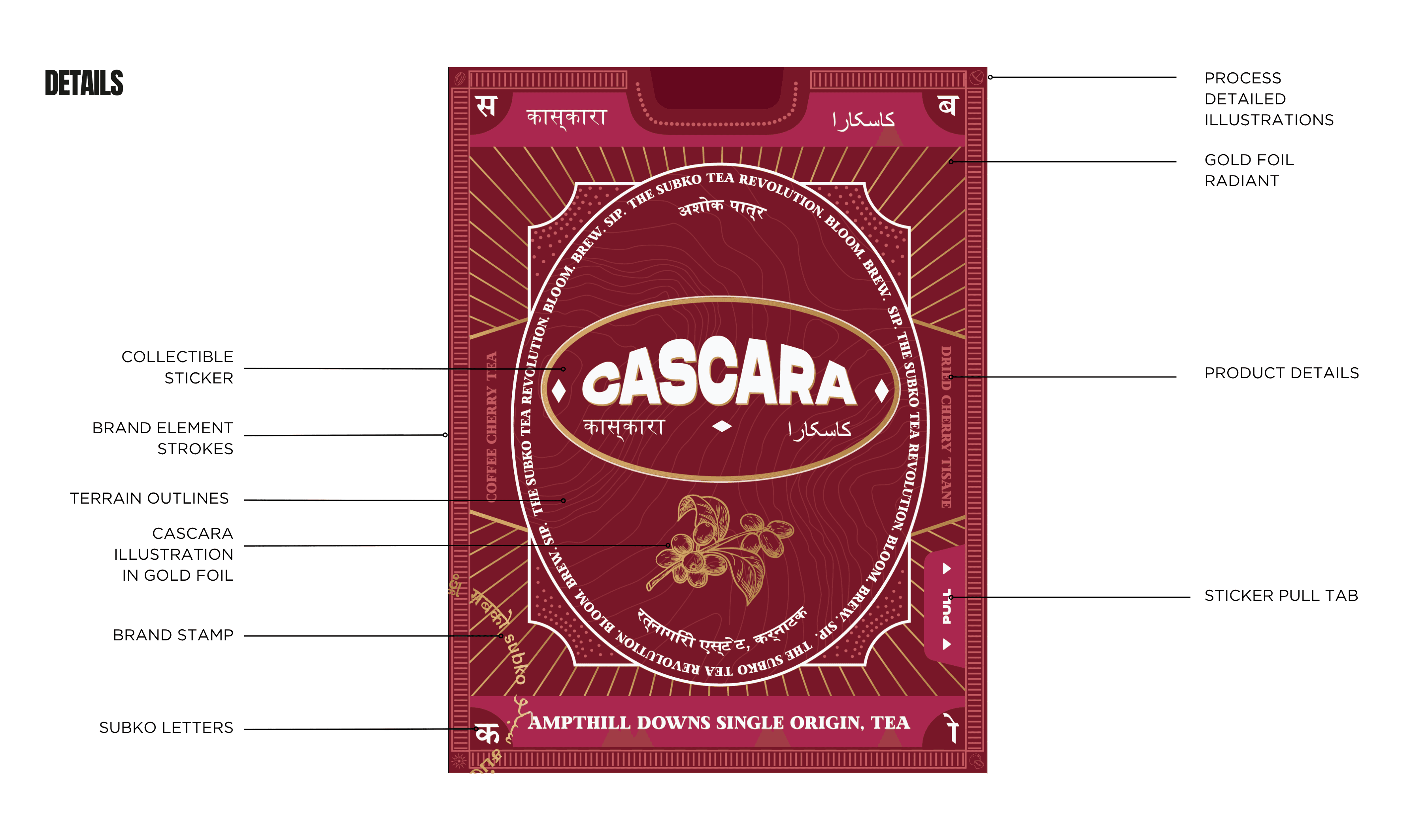


Subko Cascara tea
Subko Cascara tea
Subko Cascara tea
project overview
Packaging design for Subko, a specialty coffee and craft brand rooted in subcontinental culture, explored through a rich, tactile and storytelling-led visual language. The design moves away from conventional minimal coffee aesthetics, instead drawing from regional typography, print ephemera, and cultural references to create a bold, collectible identity. The packaging system uses box formats instead of standard coffee bags, layered with screen-printed labels, multiple scripts, and evolving colour codes that reflect origin and sourcing, turning each pack into a narrative of provenance and craft.
Packaging design for Subko, a specialty coffee and craft brand rooted in subcontinental culture, explored through a rich, tactile and storytelling-led visual language. The design moves away from conventional minimal coffee aesthetics, instead drawing from regional typography, print ephemera, and cultural references to create a bold, collectible identity. The packaging system uses box formats instead of standard coffee bags, layered with screen-printed labels, multiple scripts, and evolving colour codes that reflect origin and sourcing, turning each pack into a narrative of provenance and craft.
project type
Packaging
year
2024
my role
Packaging Designer
client
Subko
project overview
Packaging design for Subko, a specialty coffee and craft brand rooted in subcontinental culture, explored through a rich, tactile and storytelling-led visual language. The design moves away from conventional minimal coffee aesthetics, instead drawing from regional typography, print ephemera, and cultural references to create a bold, collectible identity. The packaging system uses box formats instead of standard coffee bags, layered with screen-printed labels, multiple scripts, and evolving colour codes that reflect origin and sourcing, turning each pack into a narrative of provenance and craft.
project type
Packaging
year
2024
my role
Packaging Designer
client
Subko


